Web accessibility at Octopus Energy

Access to energy – and to the internet – are universal human rights. For that very reason, we've always maintained that buying energy should be as easy as buying cornflakes.
As the World Health Organisation explains, disability isn’t inherent – disabilities arise when society is built in a way that doesn’t take people's needs into account.
In other words, it’s our job to cater for each of our customers and remove the barriers they might otherwise face while using such a crucial service, whatever their access needs.
As Head of Front-end Development at Octopus Energy, I have a big role to play in making sure our website and online communications meet high accessibility standards (and to work with other departments to make sure that everything we do is similarly inclusive). I've also written a practical guide to instruct other designers and developers on creating websites inclusively. You can find out more about my book here.
Below, you'll find an audio version of the first chapter. This will take you through why web accessibility is so important, some of the benefits of prioritising it, and how the rest of the book will take you through practical steps and advice for helping your sites cater for a range of access needs.
Making time for accessibility
Companies often argue that there isn’t the time or resources to build their services in a way that caters for a wide range of users. This isn’t just unacceptable, it’s simply untrue.
Look at it this way: almost every company will tweak their website to make sure it works with a wide range of different web browsers. Yet for every person using Internet Explorer 10 or less, there are six people with significant sight loss. If we’re willing to spend time making sure that our websites work on old, rare browsers, why can’t we spend a little effort to reach potential customers who experience visual impairments - or any of the one-in-five people who experience some form of disability, for that matter?
Once we began to understand our customers and design for a wider range of specific (but often neglected) access needs, we realised that in the process, we were making life easier for the vast majority of our customers. An automatic door makes life easier for wheelchair users and Sign Language speakers (who have to pause their conversations to turn a door handle) - but they also help anybody with their hands full. In exactly the same way, a clear, uncluttered web page can make a world of difference to somebody who experiences a visual or cognitive impairment, but it will also help anybody who’s looking for information in a hurry. In short, accessible design is good design - it makes things easier and more enjoyable for everybody.
Web accessibility at Octopus Energy
We've always championed accessibility and that starts at home. Four years ago, we did a full accessibility audit of the Octopus site to make sure it was as inclusive as possible and that work has been ongoing ever since – accessibility is one of the most important concerns built into our website.
When it comes to the website, we adhere to the Web Content Accessibility Guidelines (WCAG). We always make sure to hit their accessible ‘AA’ rating, we go over and above to achieve a ‘AAA’ rating where we can, and we’re constantly on the lookout for unique ways to cater for our customers that the WCAG standards don’t cover.
With that in mind, here's just some of the steps we take to ensure Octopus' website, customer service experience and communications are as accessible and inclusive as possible.
Navigation
'Skip to Main Content’ buttons
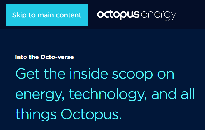
You might not notice it, but the first item on every Octopus Energy web page is an elusive ‘Skip to Main Content’ button. If you press the ‘tab’ key, you’ll see this button magically appear in the top left hand corner of your window. We include these for blind or visually impaired users who rely on screen reader software to navigate the internet (screen readers read a page’s content out loud from top to bottom). Without these buttons, these users would have to listen to a long list of menu items and other irrelevant content every time a page loaded.
On the website of one major Big Six supplier, we found it takes 11 minutes for a screen reader user to get past all the generic menu items and access the page’s unique content. 'Skip to main content' buttons also make things easier for our motor impaired customers, who navigate using only a keyboard (by tabbing from item to item).
Keyboard traps
For users who navigate the web without a mouse, we also make sure that we never include ‘keyboard traps’ on our web-pages. These are nasty bits of content (often pop-ups, for example) that users who navigate with keyboards can tab into, but can’t tab out of – ‘trapping’ them on that part of the page. Either that or sometimes they're popups that appear but don’t move 'keyboard focus' into them when they appear, so the user is left cycling through page content and can’t close or interact with the actual pop up. (Ironically, these are sometimes pop ups asking users for feedback on their experience on the site.)
Self-contained actions
We ease navigation and comprehension in other ways too. For example, we always make sure to use self-contained actions. This means that you won’t see links or buttons that say "next" or "click here". Instead, each action will describe exactly what will happen when you interact with it. This generally makes things clearer and easier for everybody to understand, but is especially helpful for customers who experience cognitive impairments or impaired mental health (who can have trouble focusing, or feel less comfortable following links if it’s not clear where they will lead).
Providing context throughout user journeys
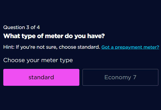
To help people who might experience difficulties while navigating ‘user journeys’, we also always make sure to provide ‘context’ that tells you how far through a journey you are (‘step 4 out of 5’, for example). Again this can be massively helpful to a range of customers (for example those who experience visual-spatial disorders - who might find themselves more easily lost, or confused in these situations).
Perception and Comprehension
For many users, navigation comes second. First, you must be able to perceive, and comprehend the content you are looking for. Everywhere we can, we work hard to remove any barriers that might stand in our customers’ way.
Alt Text
Users with visual impairments who navigate with screen reader software (which reads web content out to them) need some way to perceive images and visual information, especially where our images provide context or meaningful information. We always make sure to include descriptions in ‘Alt Text’, which is read out by screen reader software in place of those images, ensuring that these users can perceive and interact with that content.
We also make sure that images that are purely there for presentational reasons are ignored by screen readers to make the experience neater and content-focused.
Responsive Design
Rather than building a static layout with one defined size, responsive design allows the content on a page to adapt to the screen of any device. It’s especially important for users who experience a range of different visual impairments who rely on magnification - it allows our web pages to maintain a coherent layout even when heavily magnified. On top of responsive design, we also make sure to never prevent additional zooming from programs like Zoomtext.
Large base font size
As well as allowing for zooming, responsive design, and catering for users who customise their computer preferences to fit their needs, we also try to provide a high ‘base level’ of accessibility. One good example is raising our base font size on our blog for ease of reading. This is especially useful for users with visual impairments, cognitive impairments, and again, makes things easier for basically everybody. This goes hands in hand with accessible line height, letter spacing and font choice.
Contrast
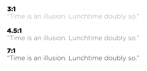
Three examples of text and background colour contrast levels - The first a failing level, then a AA compliant level, and finally a AAA compliant level.
Contrast, especially when done badly, can be a massive barrier to perception - making things much more difficult to read for everyone. On the other hand, when done right, a AAA compliant contrast can increase accessibility for a wide range of users, including those who experience autism, dyslexia, and a wide range of visual impairments. We’ve worked hard on our page designs and colour schemes, making sure that they provide a clear, accessible contrast, while keeping the brightness down for any customers who experience photosensitivity.
Colour
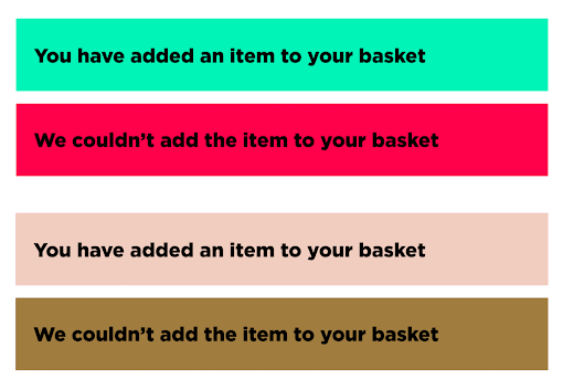
Here, the latter set of alerts are shown as they would be perceived by someone who experiences red-green colourblindness.
We make sure that we never rely on colour alone to convey meaning or status (we’ll always combine colour with icons and descriptions, for example). Relying solely on colour to convey meaning (like using a red underline to show an error on a form, for example) can be a massive barrier to users who experience colour blindness. We also use a tool called sim daltonism to simulate what our site roughly looks like to customers with different forms of colour blindness, so we can see where any meaning might be lost, or confusion caused.
Iconography
Icons are an important aspect of web design - developers often use them to help create a streamlined, uncluttered look. But without additional context, they can often come across as indecipherable - especially to those who experience impaired visual comprehension and other cognitive impairments. Where we do use icons, we make sure to include a label or description (like we have next to the ‘menu’ icon at the top of this blog!).
Accessible communication
We work hard to make sure that we communicate with our customers in an accessible way. Accessible communication is all about providing options, and making sure that each of those options meet a base level of accessibility.
Having multiple platforms is the first principle of accessible communication. This way, we ensure that customers can communicate in the way that best suits their access needs. For example, Deaf customers are more likely to communicate by email. Providing a variety of options is also vital for customers who experience communication anxiety. Some of these customers don’t use the phone, others don’t use email, and others won’t engage with letters they receive in the post. Communication anxiety is relatively common and forcing these customers to communicate in a way that is incompatible with their needs can have serious health impacts. As one customer, quoted in Money and Mental Health’s ‘Levelling the Playing Field’ research, explains: ‘I have massive anxiety about talking to strangers on the phone. I frequently end up feeling exhausted or at worst suicidal afterwards.’
With that in mind, we ensure accessible communication by using a range of platforms:
Phone - we use an application called Twilio to enhance the accessibility of our Telephone communication. Twilio allows us to help match customers with energy experts who are already familiar with their needs, for example.
Facebook messenger - we understand that many users find familiar sites more predictable, and accessible. For this reason we’ve made sure that customers can check out our page, chat to us, and even get a quote based on their individual circumstances, all before they leave the comfort of Facebook for a site like ours.
Accessible Email...
Accessible email
A lot of work goes into making sure that our emails provide a high level of accessibility, while also allowing for customisation, so customers can control and personalise their emails. Here are just a couple of examples of what we get up to:
Action buttons
We use action buttons in our email subject lines to cut time and point out important information. For example, in meter reading reminder emails, you can click an action button in the subject line to submit meter readings to your energy account securely without even inputting a password or opening the email.
ARIA roles on html emails
Just as we use ‘alt tags’ to make web features visible to our blind customers who navigate using screen reader software, it’s also important to hide unnecessary features that might otherwise be read out, cluttering up the webpage as they attempt to navigate it. Emails are generally built using a series <table> tags, which we hide using ‘ARIA roles’, so that screen reader software doesn’t keep reading out strange words like ‘<table>’ and other jargon while you’re trying to get through one of our emails.
TL;DRs
TL;DRs, or 'Too Long; Didn't Read's, are small boxes up top of an email sharing its main points succinctly. They make life a lot easier for those who experience reading difficulties, who might struggle to navigate and pick out important information in an email - and anyone who's in a hurry!
Customisation
In order to cater for the widest range of customers we’ve also designed our emails, and our online account, to be as customisable as possible, so people can have as much control as they like over how they get their energy, and do it their way.
Plain text emails
A wide range of quirks and rendering issues that can crop up thanks to the millions of different email clients available. For this reason, many users (and especially those with cognitive impairments and visual impairments) prefer plain text emails for their consistent linear layout, so we make sure to include a plain text option.
View your emails via our online account
Browsers tend to be a lot more consistent, feature rich, and work better with customised browser and computer settings when it comes to displaying content online. For this reason, customers can view all past emails in their online account.
Theme switching
We allow all our communications in black on white, (or white on black) which is really useful for people who experience a range of visual impairments, cognitive impairments, and dyslexia.
Default font size
We also allow people to change their default email font size (and to change their line height), so that it is easier to perceive, and comprehend. On our site, we also make sure to use a big base font size to provide a good base level of accessibility, and we make the font on our blog about 4 points bigger than required, just for good measure!
WE TEST!
When it comes to accessibility, we understand that every site and service is unique, and there’s always a chance we might have missed something. For that reason, the best way to guarantee accessibility is to test. For example, we test our services with a range of users and techniques, including screen reader software, keyboard only users, and colour blindness simulators. We also make sure to test future code preemptively, so that any issues can be spotted before they head into the code base.
If you're interested in reading more about our work with accessibility:
Read our findings from our original accessibility audit, way back in 2016.
Earlier this year I wrote a book about designing websites for users with a wide range of difference access needs - it goes into the topics we talked about here, and more in much more detail. It's suitable for beginners and experts, as well those who work with web content, but aren't necessarily developers themselves. Read more about it here, or buy a copy of Practical Web Inclusion & Accessibility here.
If you’ve got questions, or you’ve spotted something that you think we could be doing a little better, please don’t hesitate to get in touch!
Published on

Ashley Firth
Deputy Chief Technology Officer