A chaos project to silence the heat pump haters? I live for this shit

UPDATE: I'm hiring a Data Visualisation Engineer! This is a rare chance to join a tiny team with a big remit.
Can you pull a compelling narrative out of raw data? Do you love to learn and thrive when being challenged?
Have a read of the article, see if it floats your boat, then press the big pink button.
One morning in March, I got a message: Greg (yup, CEO Greg) wants a public dashboard showing the realtime data from our fleet of Cosy heat pumps. Oh, and it needs to be live before the end of next week.
It’s exactly this kind of pressure that I and my colleagues thrive under. Let’s do this! Here’s a window into the beautiful chaos that followed as we made the Octopus Cosy Heat Pump Fleet Performance Dashboard.
I’m Robin and I lead the Data Visualisation team at Octopus. I’ve been working here for just over four years and I’ve been involved in a number of projects that you might have seen, such as Balance Forecast, Wasted Wind, and my personal GB Renewables Map. This one — time-sensitive, highly transparent and something no energy supplier has done before — was right up my street.
Why did we make the dashboard?
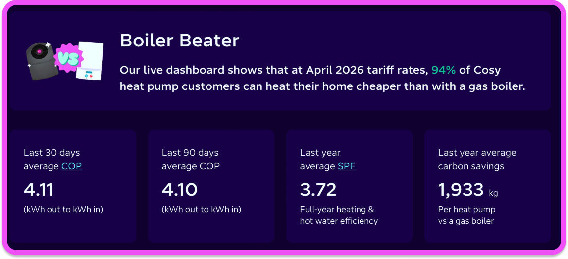
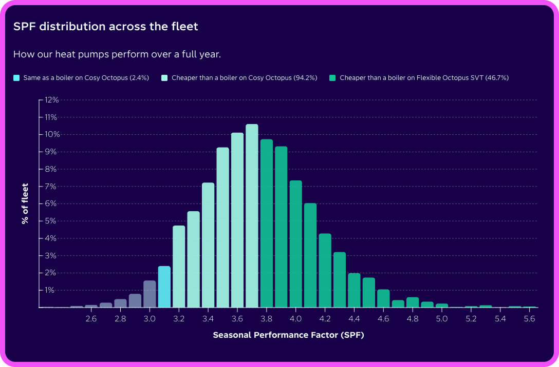
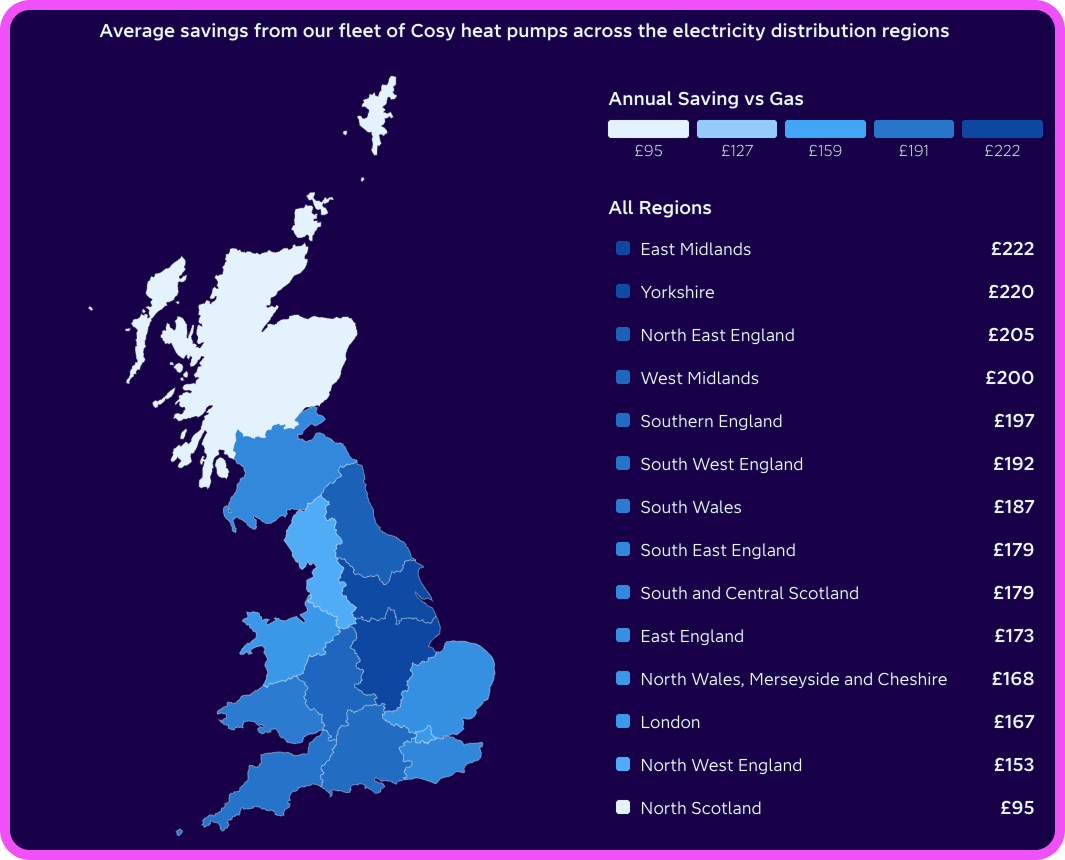
We wanted to prove that the performance efficiency of heat pumps (SCOP) was superior to a gas boiler — and that they were cheaper to run. More broadly, we wanted to tackle the immense amount of BS spread around heat pumps. I know more about this BS than most. I spend a lot of time on socials (find them all here) using data and storytelling to debunk the misinformation around renewables and the energy transition.
You know, all the usual guff from people who have vested interests in keeping boilers so we can burn “gas made from grass” (yeah, seriously). They claim that heat pumps don’t keep you warm in the depths of winter, are mega expensive, and that if you get one you’ll need to get used to having tepid showers because they don’t heat water as well as a boiler. None of it’s true.
Fortunately it’s easy to disprove all of this when you have realtime data from a fleet of many thousands of actual heat pumps in actual homes. Obviously, customer privacy is locked down tight. But when it comes to our commercial performance metrics? We decided to just dump it on the internet for everyone to see.
Most energy suppliers treat this kind of data like state secrets because they're terrified of looking imperfect. But this is Octopus, and transparency starts right at the top.
No time to faff around
So was there a plan that had been sent back to the top to be signed off before we could start? Hell no. We just got stuck in and worked it out as we went. There was a core team of about five of us, with a few others dipping in
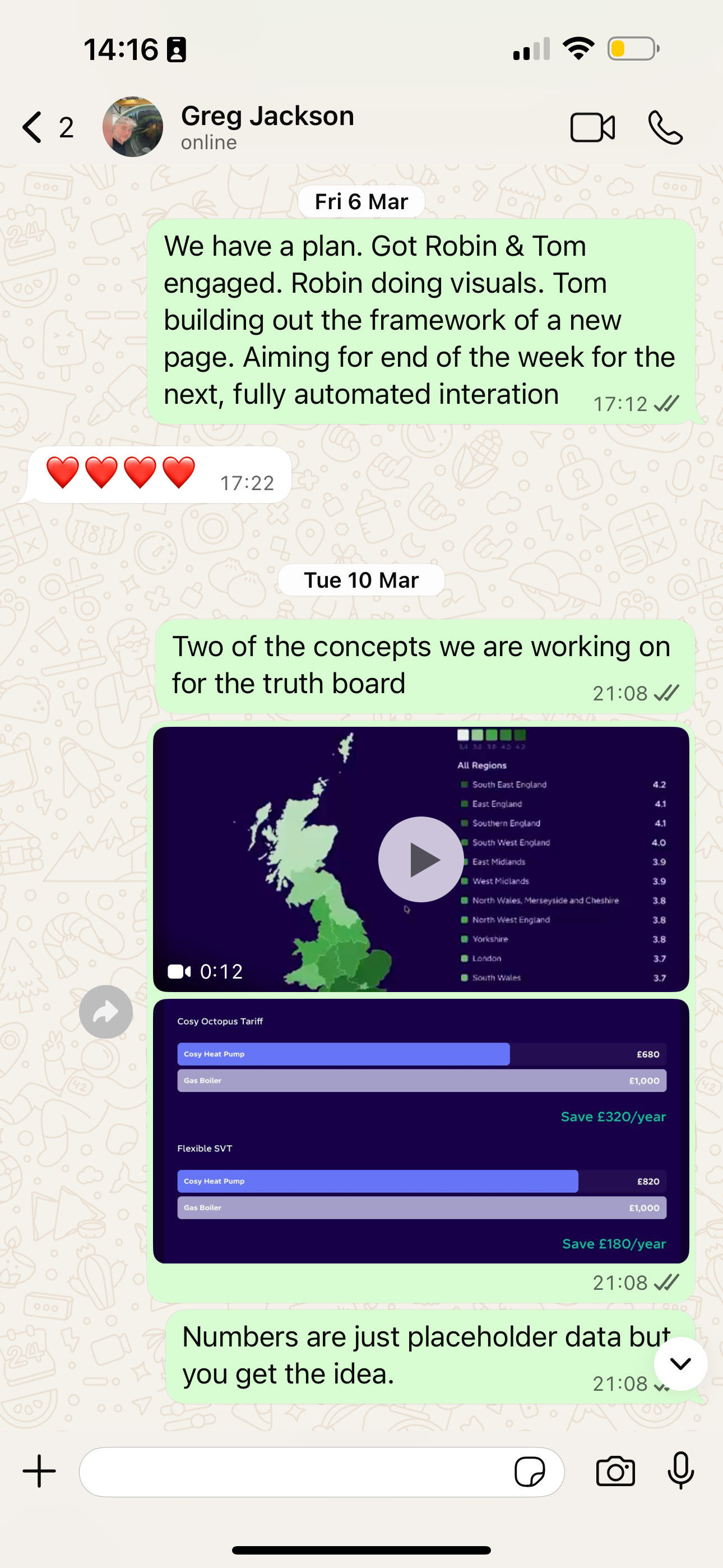
If we peel back the curtain on how a sprint like this actually works: on day one, my colleague, Tom, spun up the site architecture in minutes. I didn't even wait for the backend data: I just started building a prototype map using dummy (but representative) data to see how the storytelling felt.
While I wrangled the visuals, my incredibly smart colleagues (shout out to Fred, Nils, and Rhys) cracked on with exposing all that glorious telemetry data so we could hook up the real numbers.
By launch day, it was pure chaos in the best way. Our project wrangler, TJ, was hyping us up in Slack, we were writing legal disclaimers in a shared Google Doc, and people were dropping into the channel asking for screenshots for a presentation Greg was giving that exact minute.
But we got it live. And the reaction on social media? It was lovely to see it being shared about by the public to combat misinformation. And we certainly pissed off the right people, so I consider that a job well done.
Perfection is overrated
One of the things I enjoy about working here is that there’s very little (if any) design by committee or over-planning of features. We simply don’t have time. The discourse and misinformation about heat pumps was happening right now. If we wanted to be a part of the discussion and counter the BS we needed to act immediately.
The approach tends to be one of considered but progressive action and then regularly reviewing as we go. The aim isn’t for perfection: that’s an impossible goal. Instead the aim is to get something done quickly but not to rush it. Get something that works and then take a step back to react and go from there.
So how long did the project take from start to finish? We must have had months to iterate on this, right? Nope. Less than two weeks. And that last week was mostly tweaks and changes before we made things public.
How to deliver sensitive projects quickly
I can say without a doubt that Octopus is the only place I’ve worked in my long career where the employees are trusted with this much autonomy to make important decisions. We were trusted to crack on, decide on a direction and get it done. It’s the only way a project like this could get delivered in the time we had.
That level of trust and autonomy can be scary, and it sometimes is. But everyone is pulling in the same direction here and appreciates that perfection is overrated. An imperfect decision is far better than procrastinating over a perfect one if it helps get you closer to your goal.
The other thing is that you have a wealth of knowledge and expertise at your fingertips. There’s always someone at Octopus who’s an expert in something and they’re only a Slack message away to ask for help. Don’t know how the defrost cycle on a heat pump works? Go and ask one of the engineers who helps design and build them.
The other aspect to delivering quickly is that we have the technology to do it. If we wanted to (and sometimes we do) we could make and go live with a brand new website within an hour. Making a change to an existing website can be done in seconds. When you have this level of reactivity the fear of imperfection soon fades because you can iterate and improve incredibly quickly.
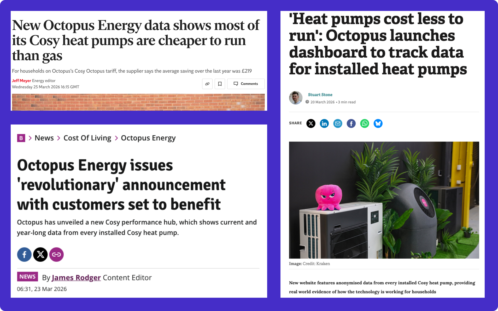
The dashboard in the press
It’s never boring here
If I could summarise what it’s like working at Octopus, it’s that it’s never boring. There’s always something new and exciting going on, even if it’s not related to what you’re working on. It’s a little addictive, in a way.
There’s always a challenge to be solved and often you need to jump in the deep end and work it out for yourself. So if you love to learn like I do, then you’ll love working here.
What I can promise you is that the work here is genuinely important. There’s not many places where your work has a tangible impact on the energy transition and our collective progress towards a low-carbon electricity system. For me that’s all the motivation I need to wake up excited each morning.
Does that sound like you too? Maybe you should join us...
UPDATE: I'm hiring a Data Visualisation Engineer! This is a rare chance to join a tiny team with a big remit.
Did you think my Cosy project sounded fun? Can you pull a compelling narrative out of raw data?
Then go on, press the big pink button.
Published on

Robin Hawkes
Senior Data Visualisation Engineer